So, Firefox decided to drop support for “old technology” plugins… Since I could not find web-extension updates for some of my required plugins or they are not ready yet (e.g. Tab Mix Plus, now called Tab Mix – Links)…
Easy-peasy: install ESR 52.9.0, then disable auto-updates… Done!
Not quite… I booted my PC this morning only to find Firefox, flicking a big middle finger to all its advanced users, had ignored my settings to not auto update – and proceeded to update itself to ESR 60.2…
Obviously, this got me royally pissed as I had to waste time rolling back and setting it up as I originally chose (i.e. no updates); and so I wasted some time to track down and neuter their update capabilities once and for all.
So:
- uninstall Firefox ESR 60.2
- grab Firefox ESR 52.9.0
- install it
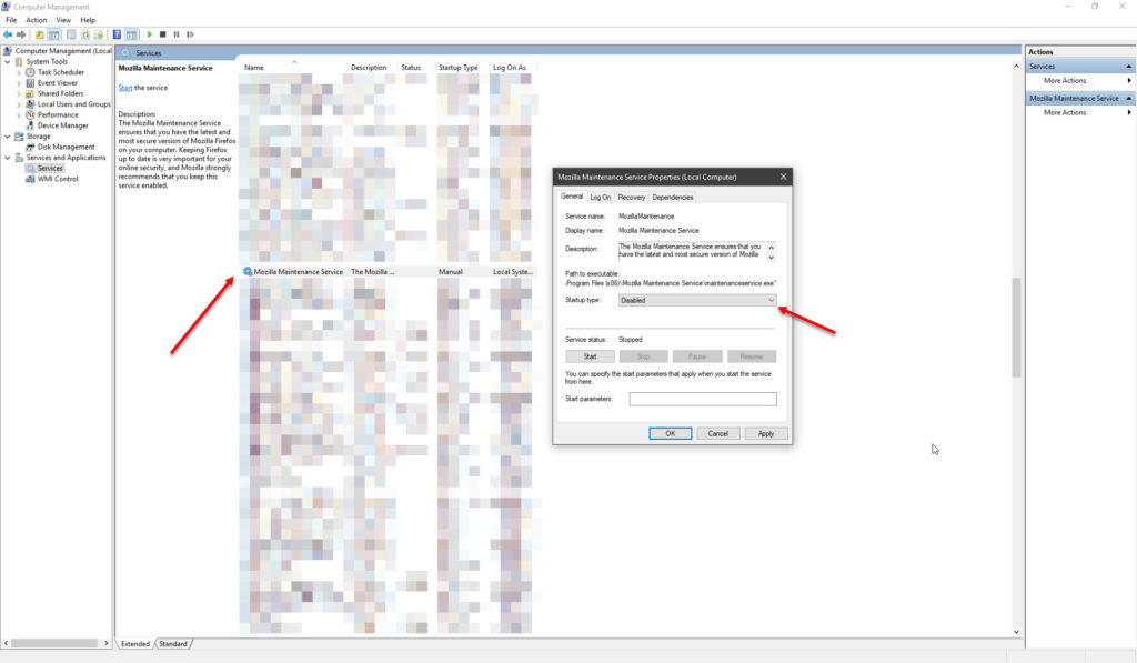
- assuming you are running Windows, disable the “Mozilla Maintenance Service” from the Services Control Panel (e.g. run
services.msc):

- then, give Mozilla the middle finger in return by ensuring the
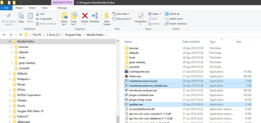
maintenanceservice.exe,maintenanceservice_installer.exeandupdater.exeexecutables are zero-bytes (and write-protected if you want to go a step further):

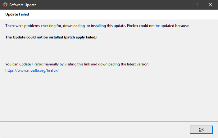
This effectively kills the auto-updater. Even attempting to update manually via the “Help > About Firefox” will fail:

To all Microsoft, browser and UI/UX developers: never, ever, assume that you know better than I on how I work – even if you have a “great new idea” – make sure that it is optional (or reversible) – because that great new idea of yours may not be (read: usually is not) so great after all.
<RANT>
Examples? Here are some for starters:
- Microsoft Office Ribbon Interface:
- takes more mouse clicks to get the same thing done as before (but because, you know, everyone uses a 8″ tablet on a train to do “real work”, so, you know, you need large buttons that fingers can’t miss – but oh, never mind that the menus are still too small to press on, or that some people do not know how to cApTalise)
- split-brain mentality (e.g. File “menu” vs. every other menu “Ribbon”; made worse when clicking on the “Properties” button where available)
- Windows 8 and 10’s new UI:
- split-brain mentality (good ‘ol Control Panel vs. “
FlatulantFluent Design” Settings pane – e.g. detailed changes to power options uses three different UI patterns, or the stupid default to not show the scroll bar until you hover over it – like, people will know there is more beyond the bottom edge, right?)
- split-brain mentality (good ‘ol Control Panel vs. “
</RANT>
